Ways & Means Innovation & Design
Ways & Means Innovation & Design is a design and consultancy company that, from its very title, finds ways to achieve finished creative concepts in all media.
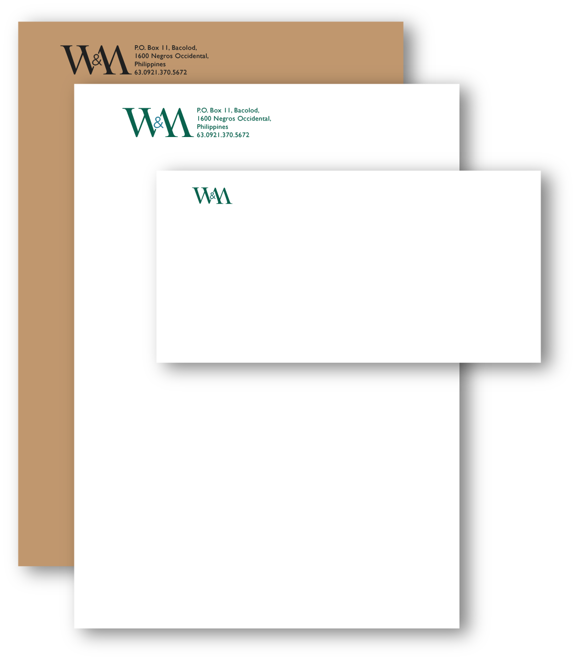
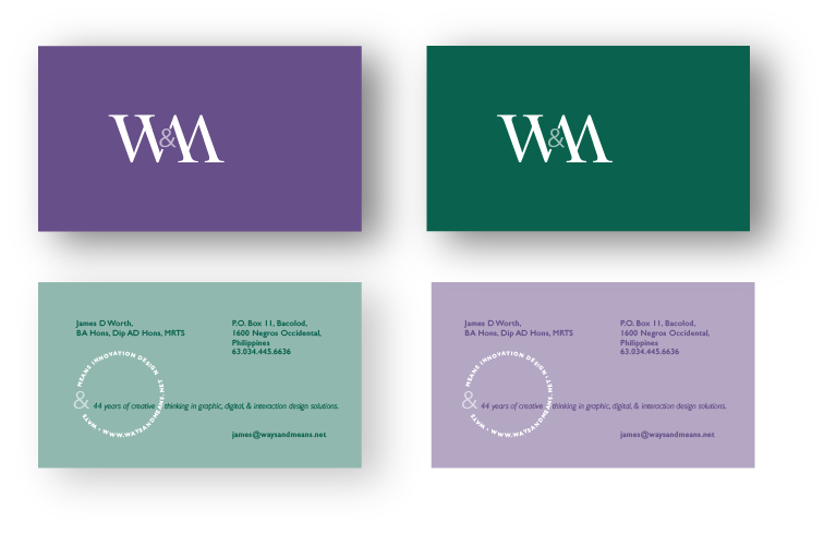
The W&M logo is designed in two parts. The elegant but cut-off serif “W&M” joined by the sans serif ampersand are a distinctive logo on their own. The addition of circular design with the company name and website details provides a secondary element. They can be used individually or together and encapsulate the design philosophy and creative thinking of the design consultancy.
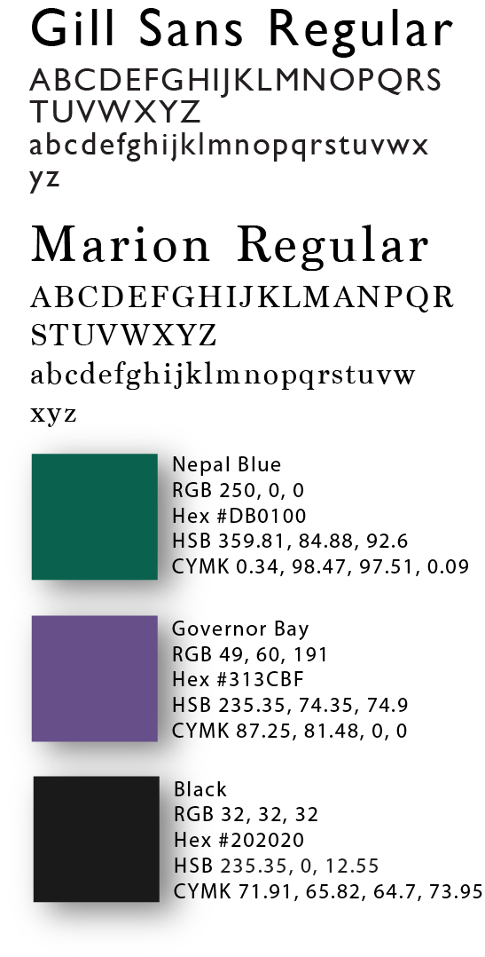
The “W&M” are hand-drawn serif letters. In contrast, the full name and web identification are in Gill Sans. Colour is (Sherpa Blue – PANTONE 3165) to correspond with the JW logo. There are two business cards with printed colour to edge on both sides and contrast between the Sherpa Blue and Heather.
