![]()
Craig and Vartorella International Marketing
1992 Originally a hand-drawn logo on artboard and then printed on a light grey rib textured paper; the Craig & Vartorella logo was printed matt black with a bright matt white foil to enhance the contrast.
![]()
![]()
The paper size used was A4 (210mm x 297mm), an unusual choice in 1992 for a company based in the USA. Corporate stationery was usually printed on ANSI letter size paper (8.5” x 11”). However, the company worked extensively in Europe, and after discussion, felt it important to move to a European Standard.
![]()
Craig & Vartorella International Marketing, Inc. was selected as one of the top 200 designs in 1993. Other winners included EarthShare, TRW, Moto du Monde, Northwest Airlines, Goodyear Tire, many of whom had only just updated their logotype, stationery, signage, etc.
“James Worth has always been in the vanguard of global designers creating corporate identities for companies large and small seeking an international marketing edge. Where James differs from others is his future-forward focus–and the inclusion of a usage manual. His work for us was brilliant, Award-winning, and fresh. Still is.”
William F. Vartorella, Ph.D., C.B.C.
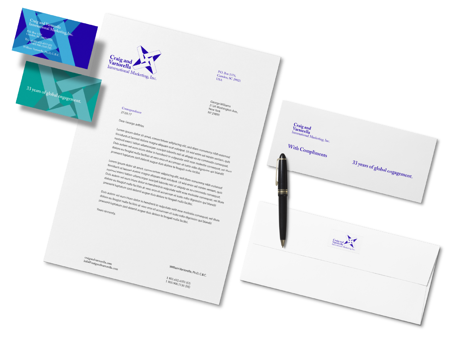
In 2018 it was time to update the logo for a more digital media age maintaining the original logo design, although with a change to a monochromatic logo and a thin line to the outer edge of the white negative space.
Old electric typewriters with their solid black ink on a polyester ribbon cannot be matched to today’s printer inks which are easily absorbed into the paper, especially a textured paper. Therefore, there was a change from a grey texture to solid white paper.
A deep vibrant blue provides the base of the new monochromatic logo with a change in the typeface from Baskerville to Adobe Caslon Pro. Caslon Pro is a slightly more compact face, which uses thinner stems and necks, providing a cleaner image when used with digital media.
Myriad Pro, with its clean and clear sans serif typeface and similar to Adobe Caslon Pro, slightly compact font style plus good readability at a small size was suggested as the main body copy for letters, printed materials, or digital assets.
![]()
Business cards have been updated to an offset coloured abstraction of the logo with printing on the reverse side in a contrasting colour and the heading “33 years of global engagement”.
![]()