The George R. Vartorella Disruptive Technologies Foundation was created as a catalyst applying cutting-edge technologies to create proactive, innovative solutions to global engineering, historical and biodiversity challenges. The Foundation, a federally recognized 501(c)3, is registered as a nonprofit in the State of South Carolina and awards globally annual grants to selected U.S. non-profits and global NGO’s.
Gadzook design was retained by William F. Vartorella to design a logo and associated print materials for the new foundation.
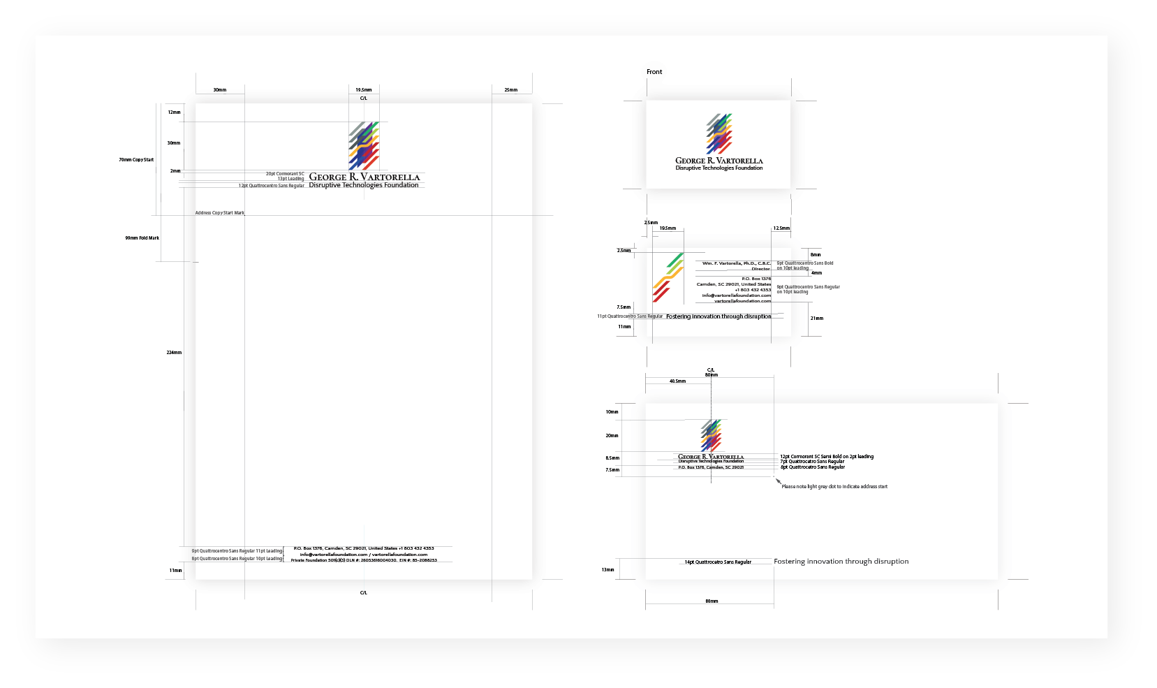
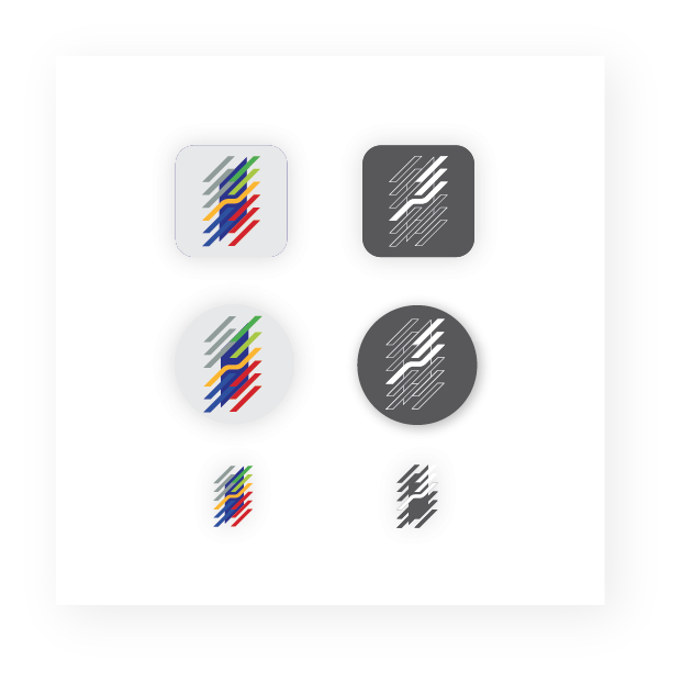
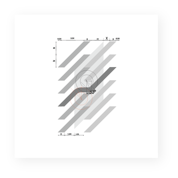
The request was for a logo, which like the original Craig and Vartorella International Marketing, Inc., is not trend-oriented but would last and stay relevant as had the original for Craig and Vartorella. After submitting several prototype designs, the final accepted logo was after several iterations completed to a finished product. This included web online and PDF manuals on usage and included logo, colour, black and white layout specifications and copy layout. Also included were page, business card and envelope schematics, social media icons, and typeface requirements. In addition, Adobe Illustrator and PDF files plus Microsoft Word templates and PDF templates for digital printing, including JPEG files for both header and footer application to emails, were supplied.
All stationery was printed in Singapore by Focus Print Pte and included embossing and Spot UV gloss and shipped to the client in the United States.
We are launching the George R. Vartorella Disruptive Technologies Foundation, complete with our exciting logotype, designed by James Worth, Bachelor of Arts (Hons) Graphic Design, Gadzook Design. James, whose international reputation in this arena is well-known, created our firm’s award-winning Craig and Vartorella logo and for which we still receive compliments 30 years after it was created. James was retained to craft something equally stellar for the new foundation. The result has stunned us, to say the least.
William F. Vartorella Ph.D., C.D.C.,
George R Vartorella Disruptive Technologies Foundation

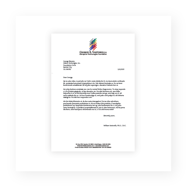
Letterhead
The logo mark and typography are centred at the top of the page and with address, contact, and Foundation 501(C)(3) identification centred at the bottom of the page.
Consideration was given to a left-justified logo mark, in line with the left margin of anybody copy with the foundation name and mission place to the right of the logo mark and justified left. However, the centred position gave the logo mark an added authority to the overall look and layout of the page.
There is a discrete fold mark of the left of the page and clear margins indicated in both Microsoft Word and PDF templates for the layout of address, date and main body copy in a letter or email.
