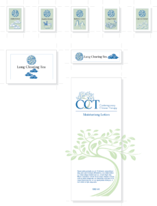
Contemporary Chinese Therapy
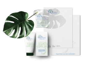
CCT is a small boutique treatment center using both modern and ancient Chinese medicines, acupuncture, and herbal remedies. In addition to providing medical services, they also provide herbs and other products under the brand name of Spring-Earth.
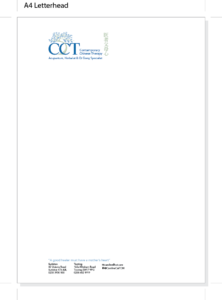
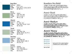
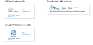
The client required a distinct logo for the main brand of CCT and a separate but relatable branding logo for the product range associated with the parent organisation. Hidden within the Spring-Earth is the Chinese character that symbolises health. Colours chosen were muted and combined in both logos. The project included a full range of letterhead, poster, and stationary-related materials plus applied labeling, printed packaging, and customer carrier products. Logos were supplied in all colour variants.

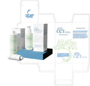
Applied labels for off the shelf packaging and printed cardboard boxes
Printed cardboard boxes for bottled, spray, and tube-based products
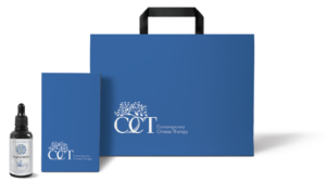
Carrier bag and presentation box
Applied labels for off the shelf packaging